HetliozPro.com website redesign
Background
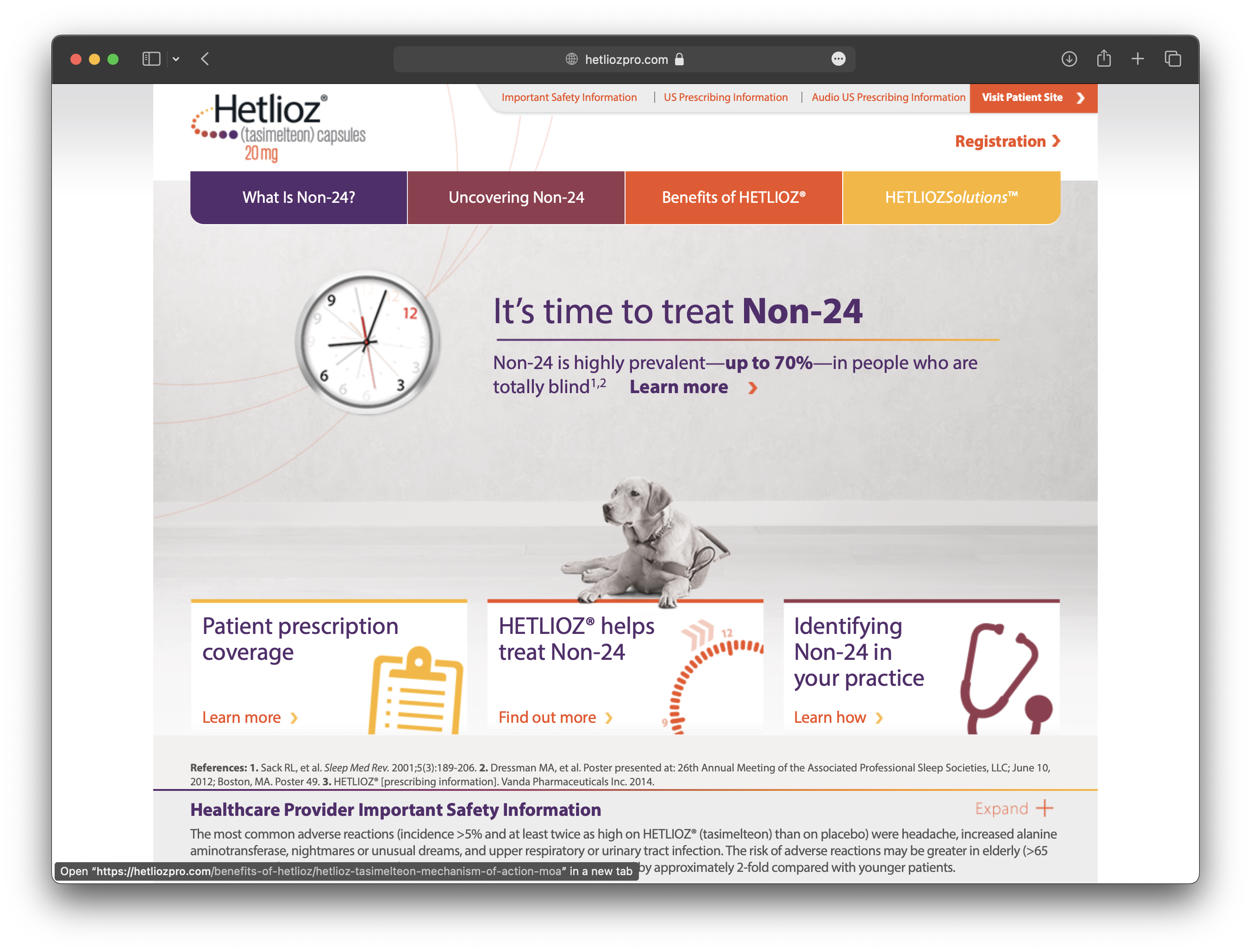
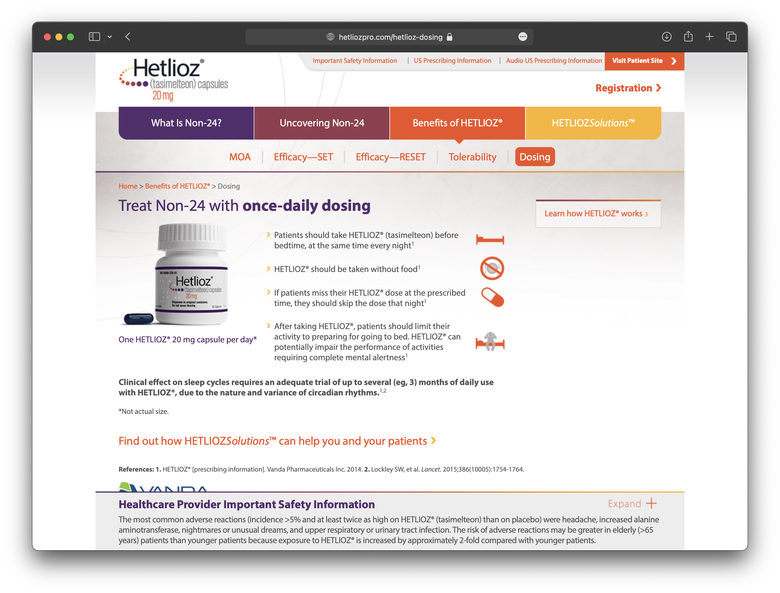
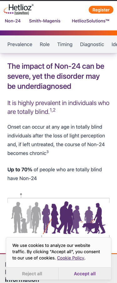
The drug Hetlioz treats a condition called Non-24 sleep-wake disorder (N24), and its website for healthcare professionals (HCP) contains multiple pages of information about the syndrome, as well as clinical trials showing the drug’s efficacy.
Challenge
Further clinical trials proved Hetlioz an effective treatment for Smith-Magenis syndrome (SMS). Given the newly granted indication, the HCP website needed to be updated to address both syndrome with equal weight.
The previous website included language and imagery relevant to N24 that does not apply to SMS, and there is no appetite for bringing in new illustration or photography.
The website is targeted toward time-constrained individuals with advanced education, so clarity of information and brevity supersede flashy visuals.
Execution
My redesign modernized the old content while making logical space for the new content. This was achieved through the addition of plenty of whitespace, simplifying the information hierarchy, and presenting the information with crisp modern typography.
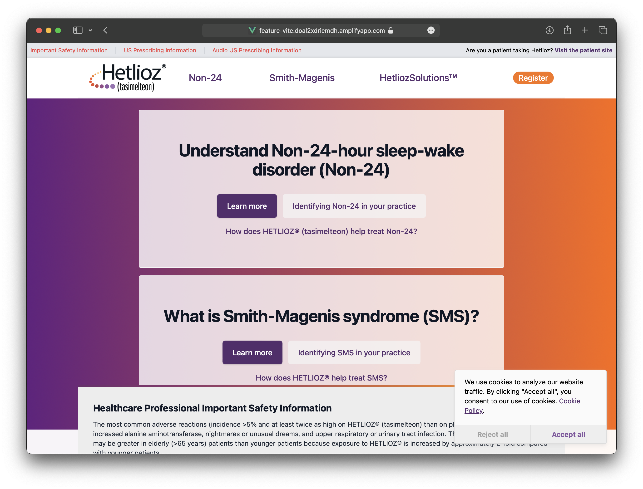
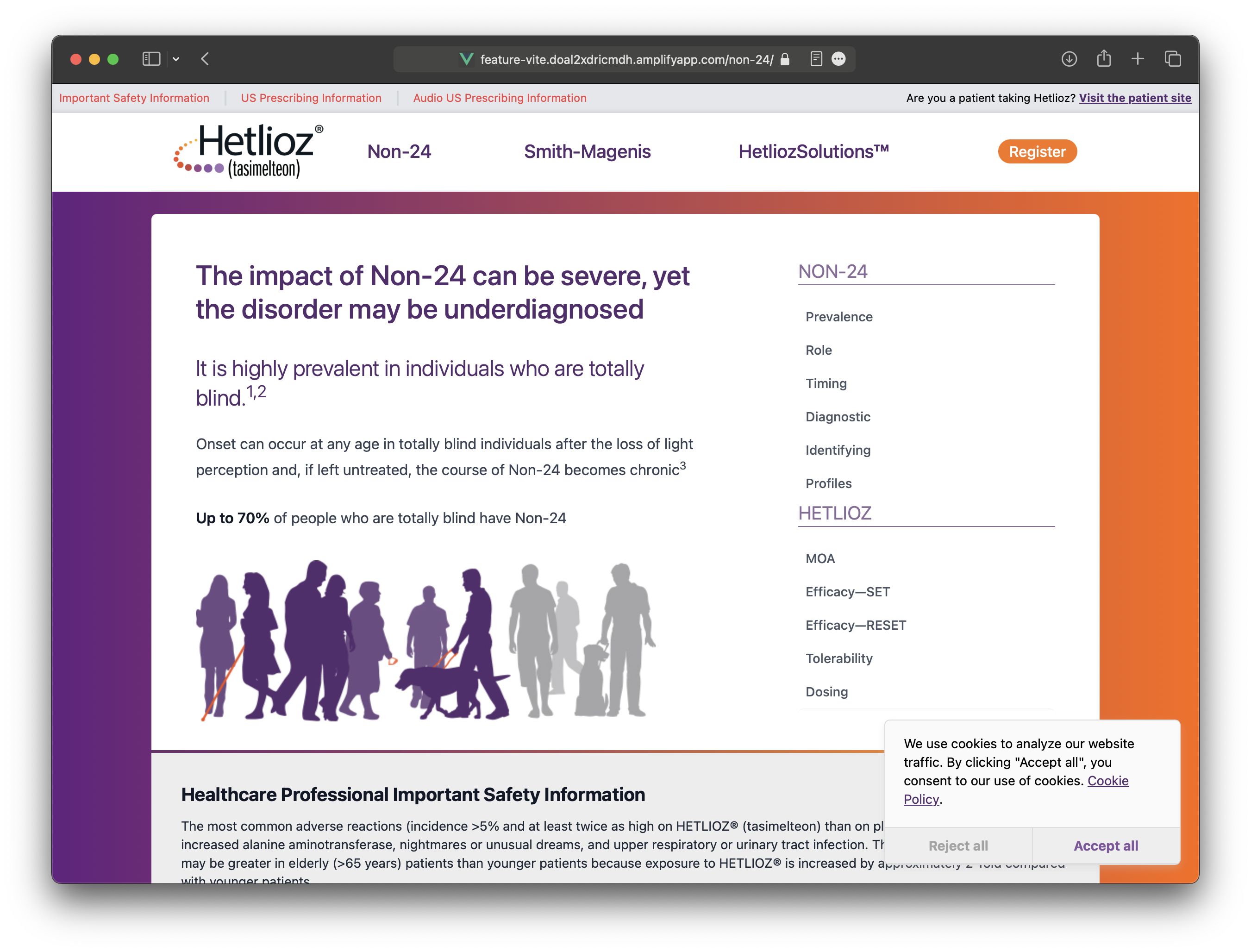
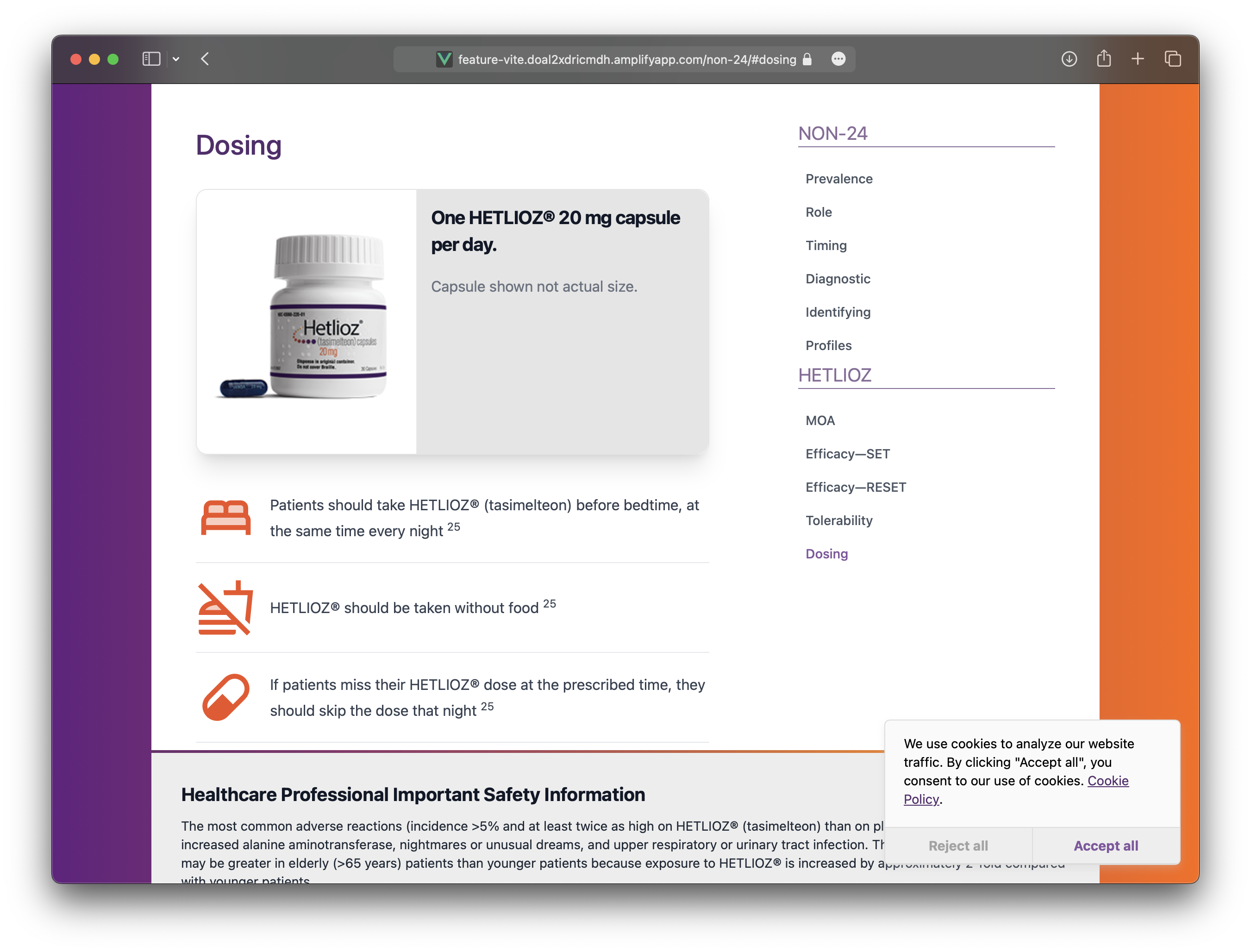
Medical affairs provided draft content for SMS following the original site’s multi-page layout, but we worked together to minimize friction for readers by condensing each syndrome’s content to a single page with content-level navigation.
Tools
To leverage my team’s familiarity with Vue and Tailwind, we built the site on Vite.js with server side generation and customized a Tailwind theme for branding. The site compiles in a few seconds down to flat files that can be hosted on a no-frills web server.